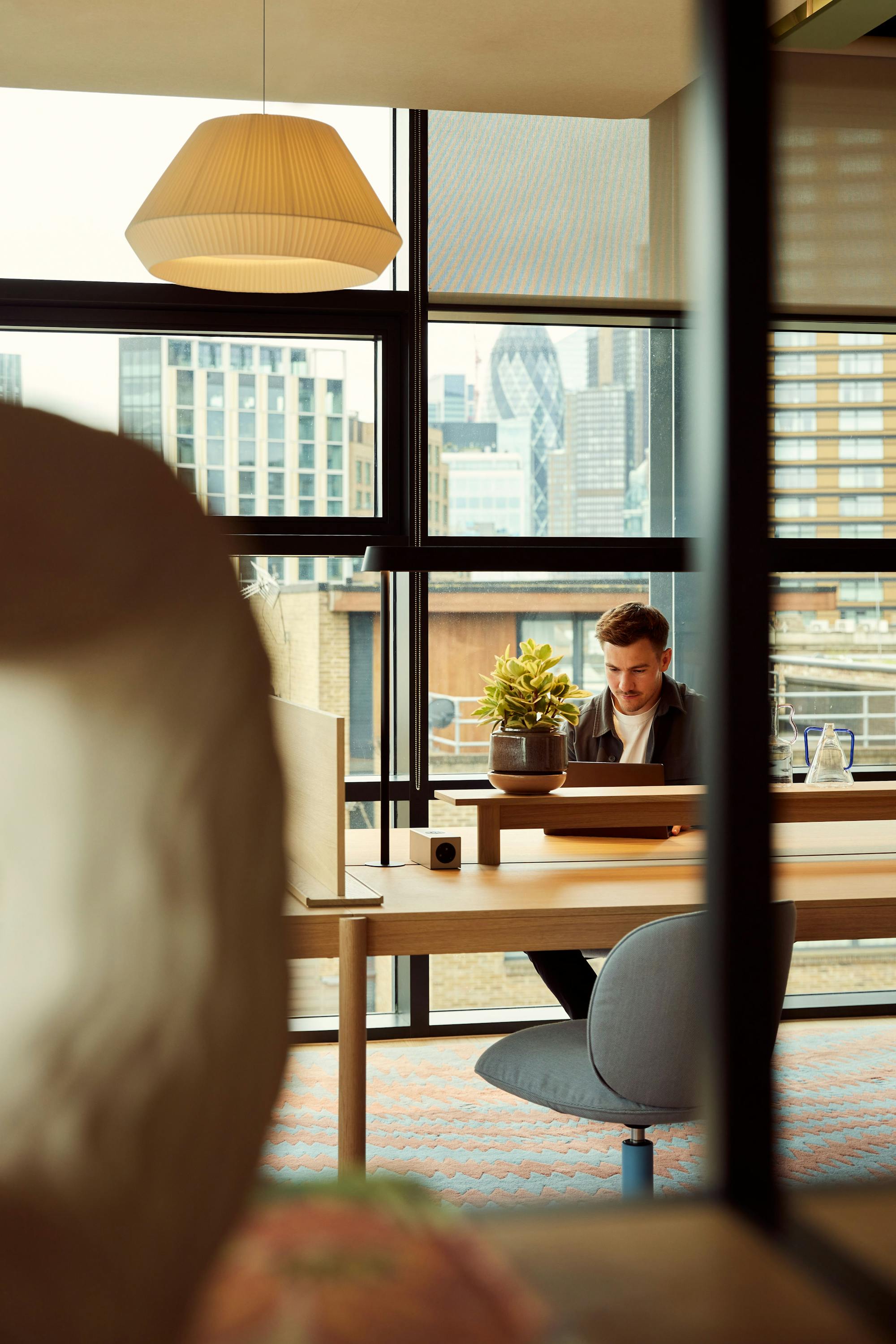
Do not disturb: find your focus in these 5 distraction-free spaces
Don’t let the productivity-sapping ‘ping’ of a notification get in your way – here are our top pick of Fora workspaces where you can switch off the noise and get into the flow.
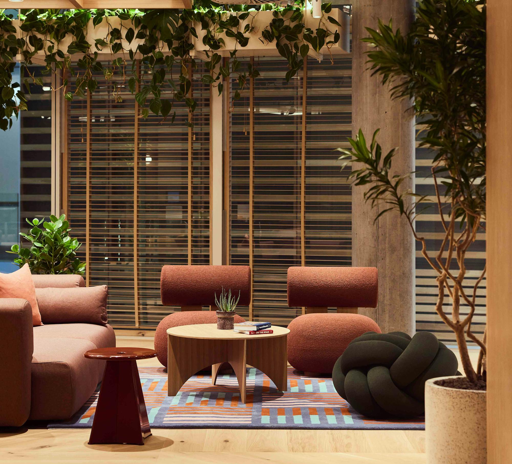
A look at five of Fora’s finest locations revealing how thoughtfully curated green workspaces encourage productivity and a sense of health and wellbeing.
Don’t let the productivity-sapping ‘ping’ of a notification get in your way – here are our top pick of Fora workspaces where you can switch off the noise and get into the flow.
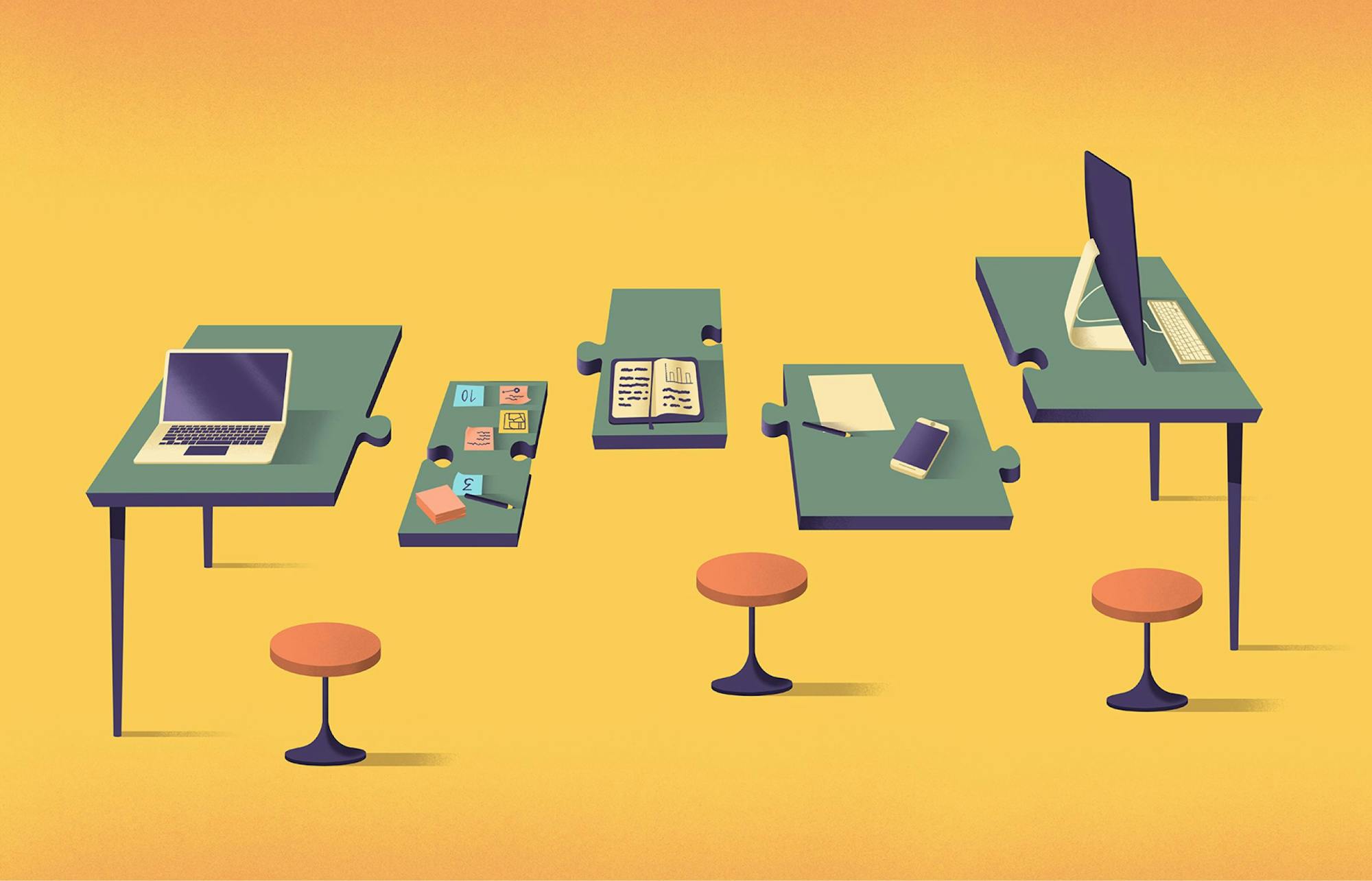
Get your head around this increasingly popular workstyle with our handy guide
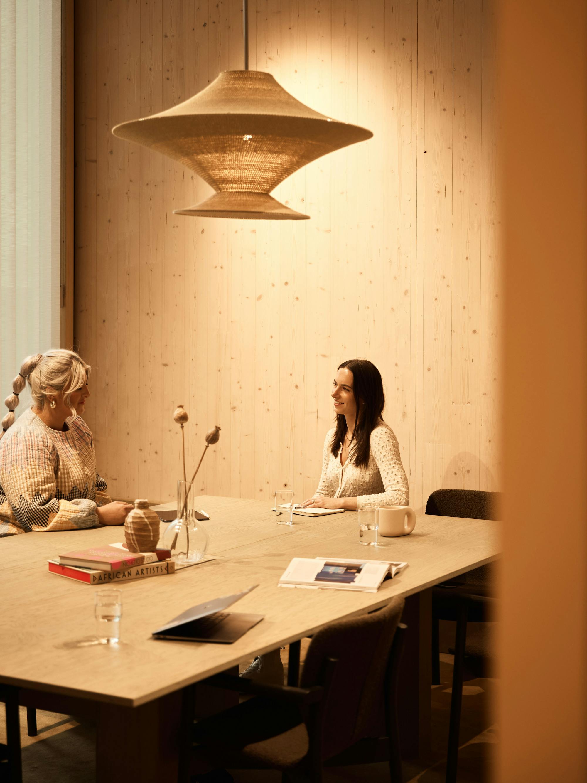
Clara Mercer, Communications Director at the British Fashion Council reveals how our Broadwick Street workspace has become the creative home of this industry-leading organisation.
Social enterprise Na’amal is wielding the power and flexibility of remote work to change refugees’ lives
When it comes to giving buildings new lives, is it better to demolish or refurbish them? The answer’s not as simple as you think
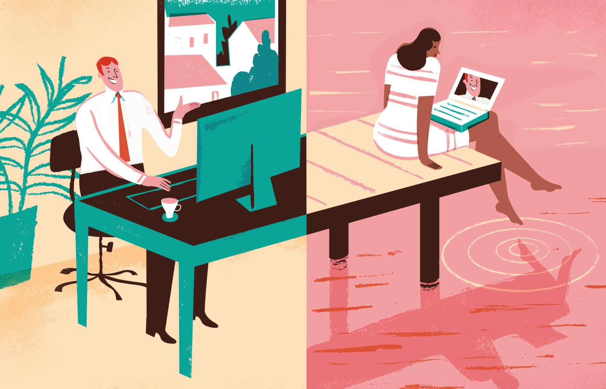
We examine the benefits and drawbacks of flex work
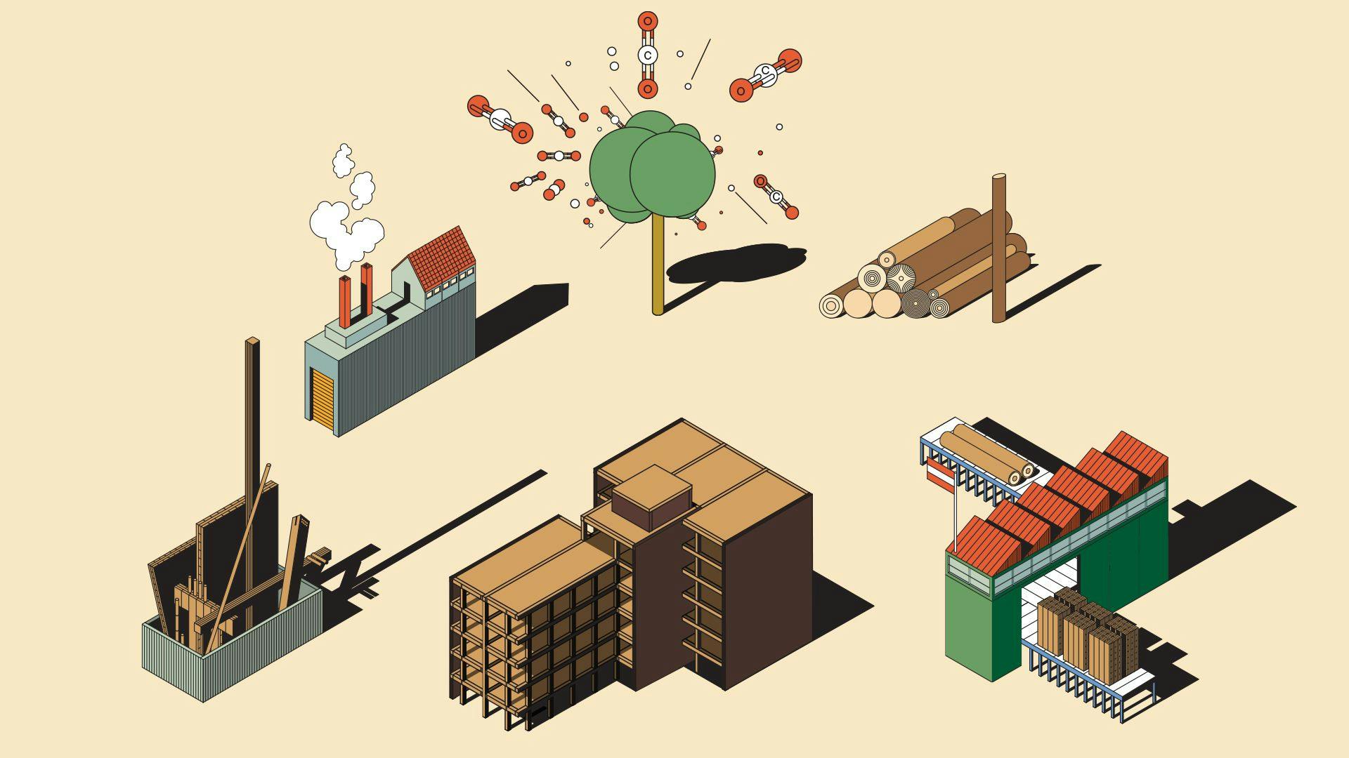
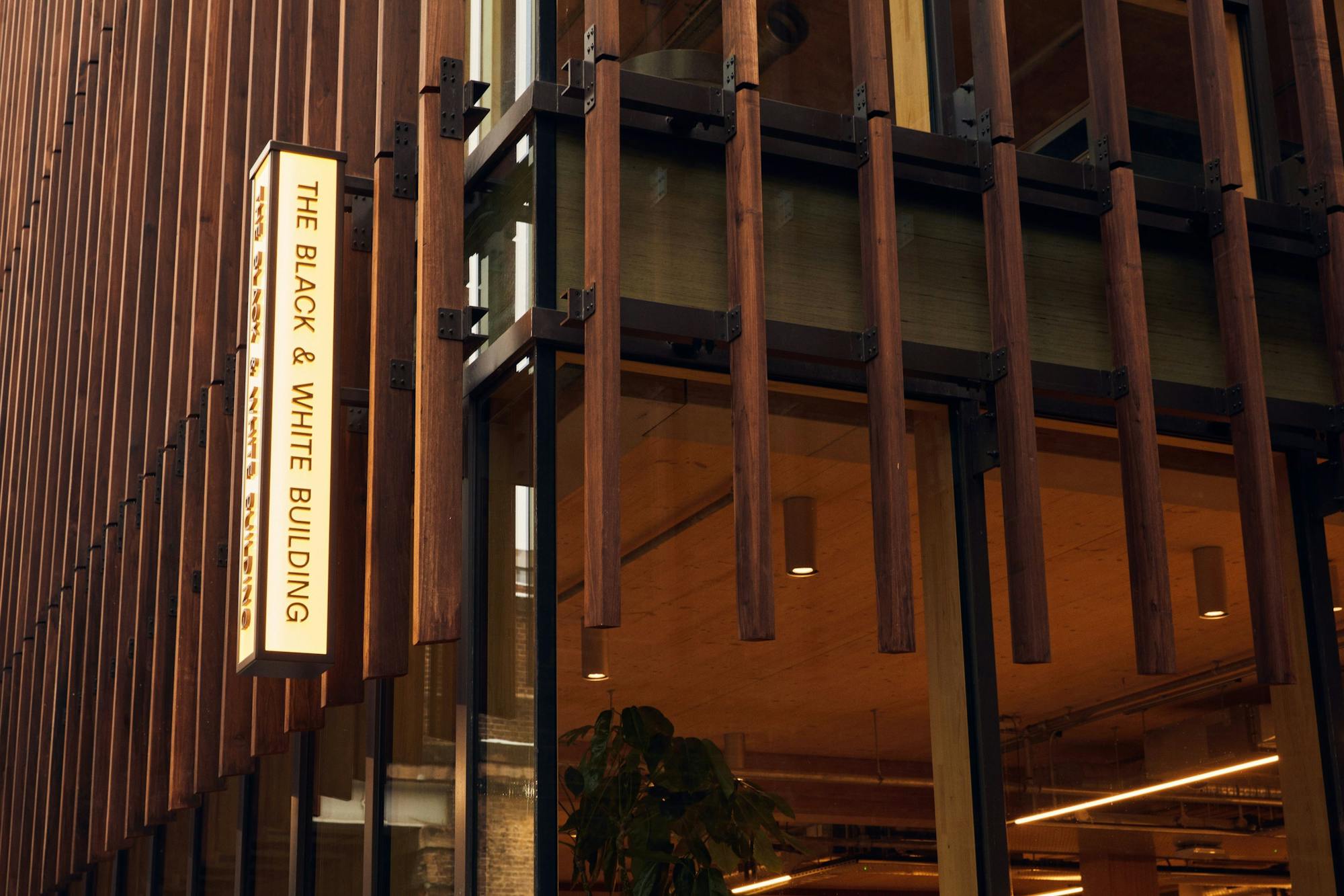
The Black & White Building is our most sustainable workspace to date. Here’s why...
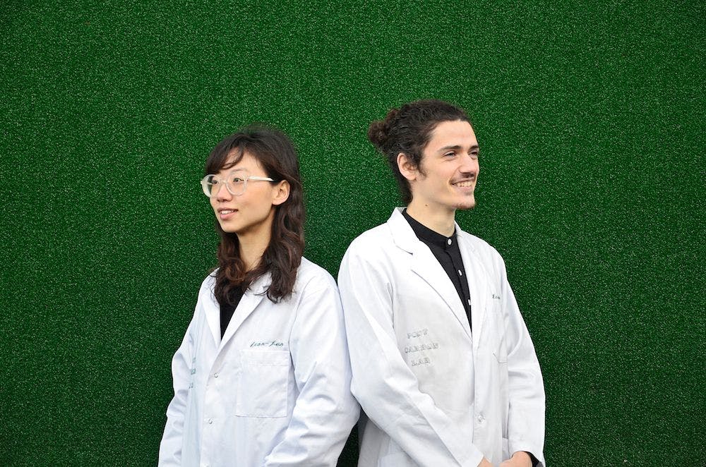
Could the clothes you wear be a solution to climate change? Post Carbon Lab thinks so; this biohacking research laboratory is creating T-shirts that capture carbon

Setting out to become the “Peloton of deep work,” Flown helps cut the distraction and isolation of remote working
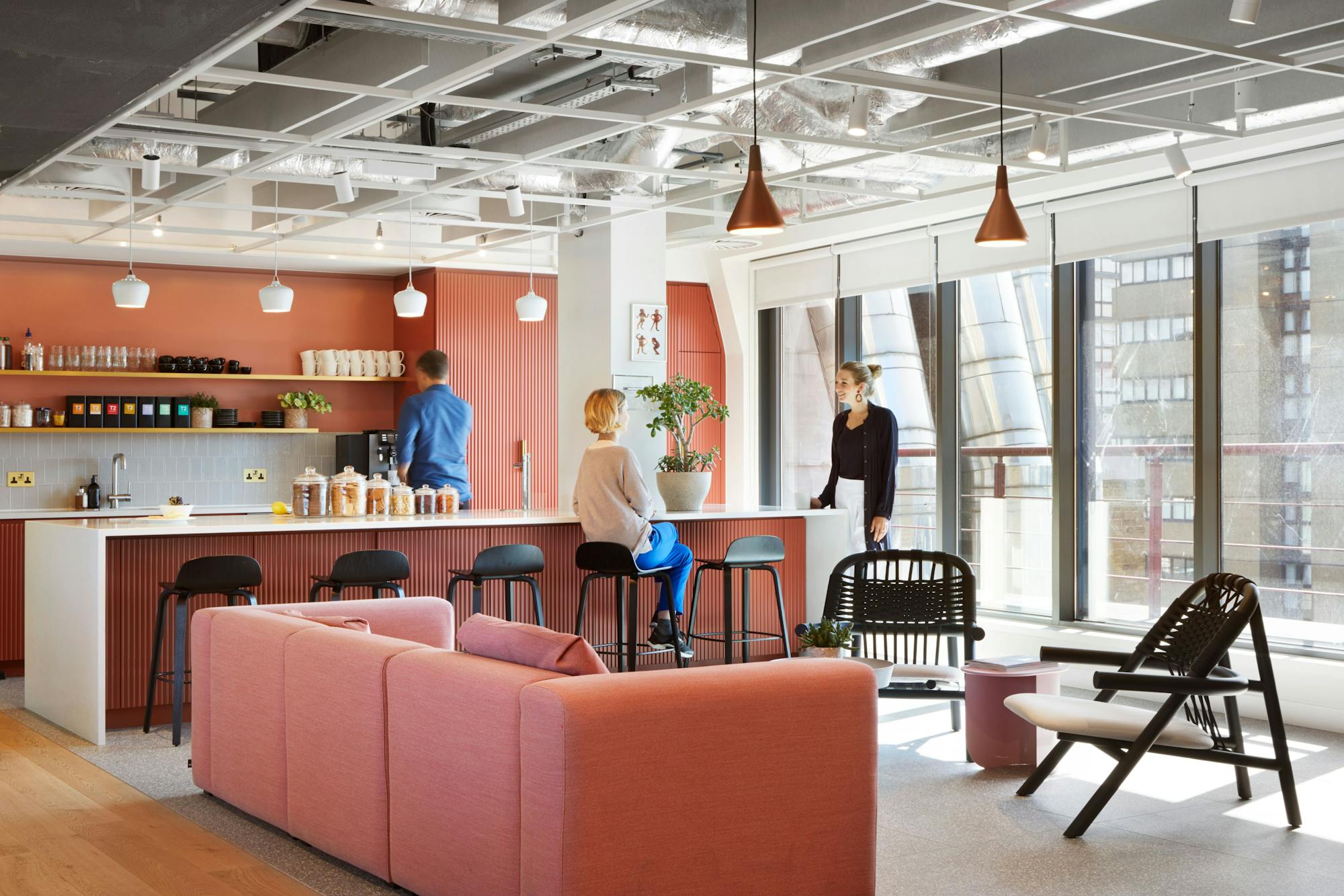
Team collaboration is the cornerstone of business success, because when teams effectively work together, they accomplish more, feel increased career satisfaction and enhance business performance. Discover our top pick of Fora workspaces where team brainstorms turn into team breakthroughs.
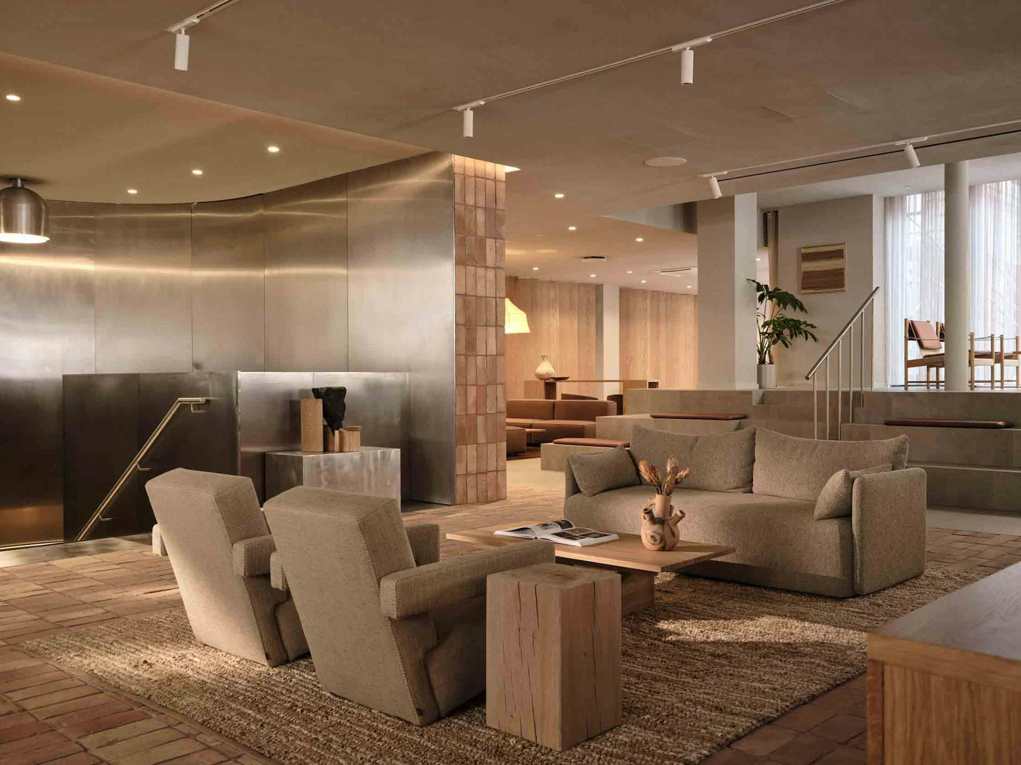
Victoria Munro, Global People Director at Pangaia, delves into balancing wellness and productivity at one of our most sustainable workspaces.
Why this east London workspace is a love letter to the neighbourhood
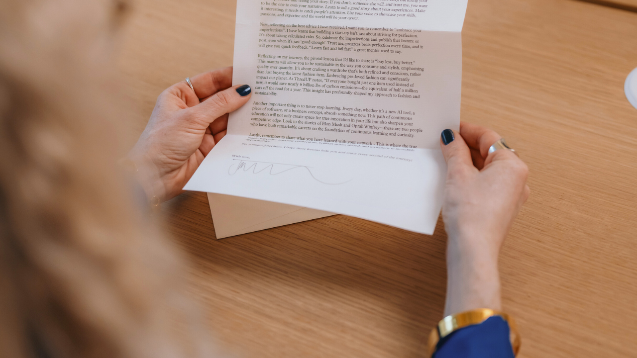
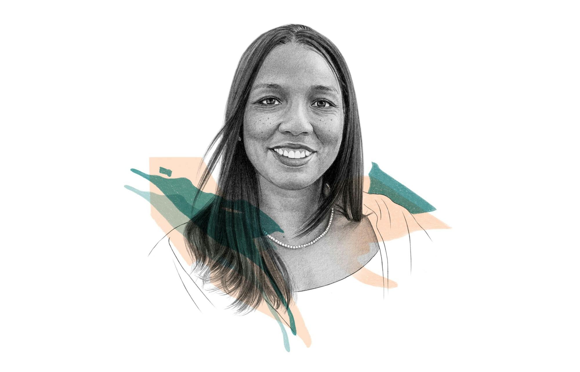
To mark International Women’s Day, four trailblazing women from across Fora impart invaluable advice they’d share with their younger selves.
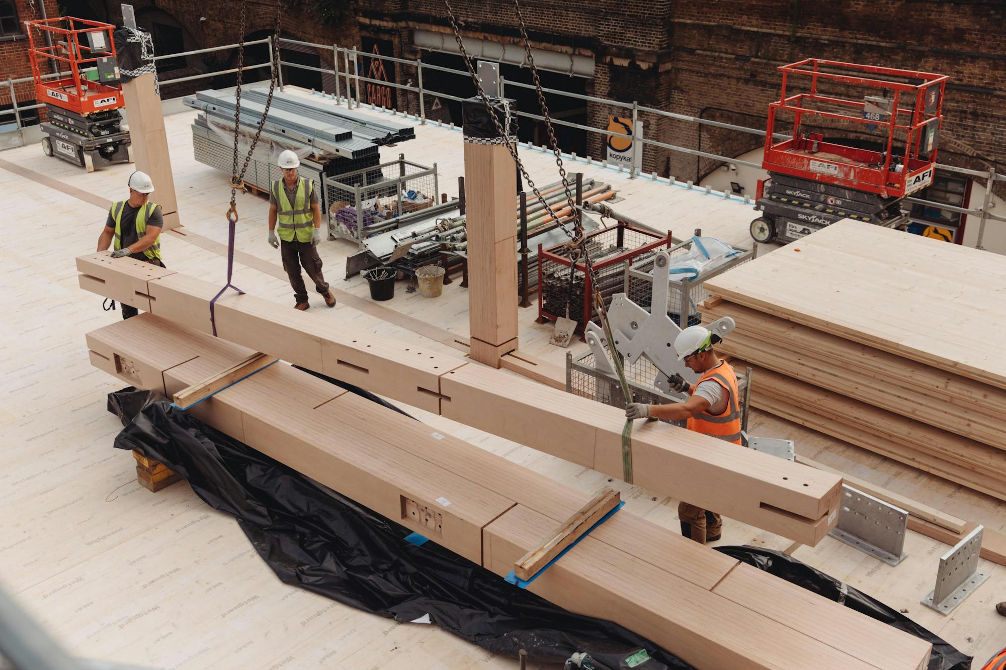
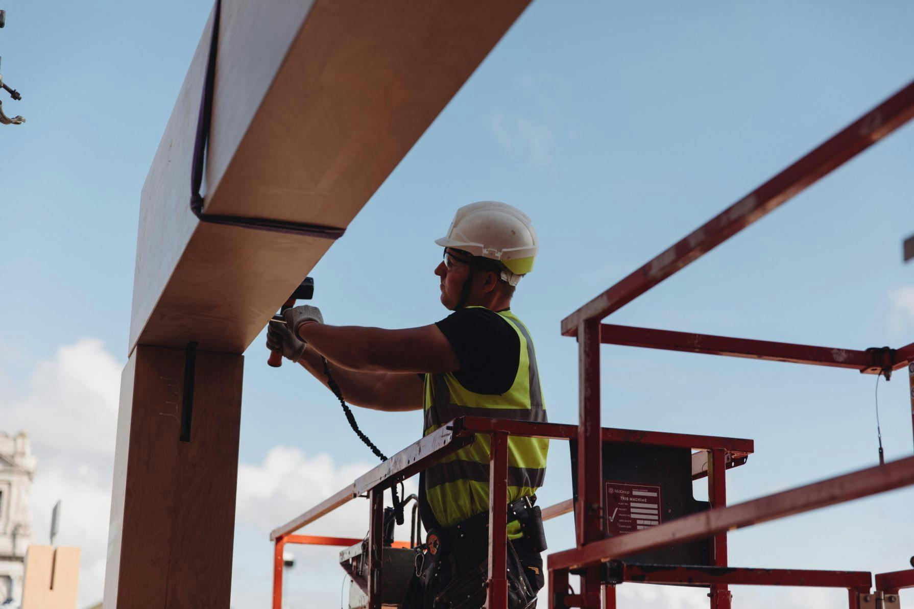
We share more on the sustainable construction practices underpinning our forthcoming work space in Shoreditch
Director of Astrid Media, Kerstin Zumstein shares why they chose Fora workspaces for their team’s London base.